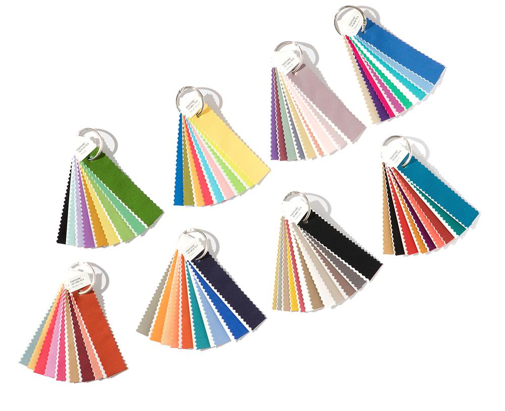
 Wow! Summer is almost over. I could cry about summer ending, but sweater season is coming upon us! So, pick your sunburnt selves up and revel in the glory of pumpkin spice everything. First things first, you’re going to need a few things this fall: a PSL in hand (pumpkin spiced latte), your favorite sweater with matching scarf, and this year’s color palettes from the masterminds at Pantone. The official color of the year 2018 is still a mystery, but this season’s “it” palette colors have been chosen. So, let's explore Pantone's color science wisdom.
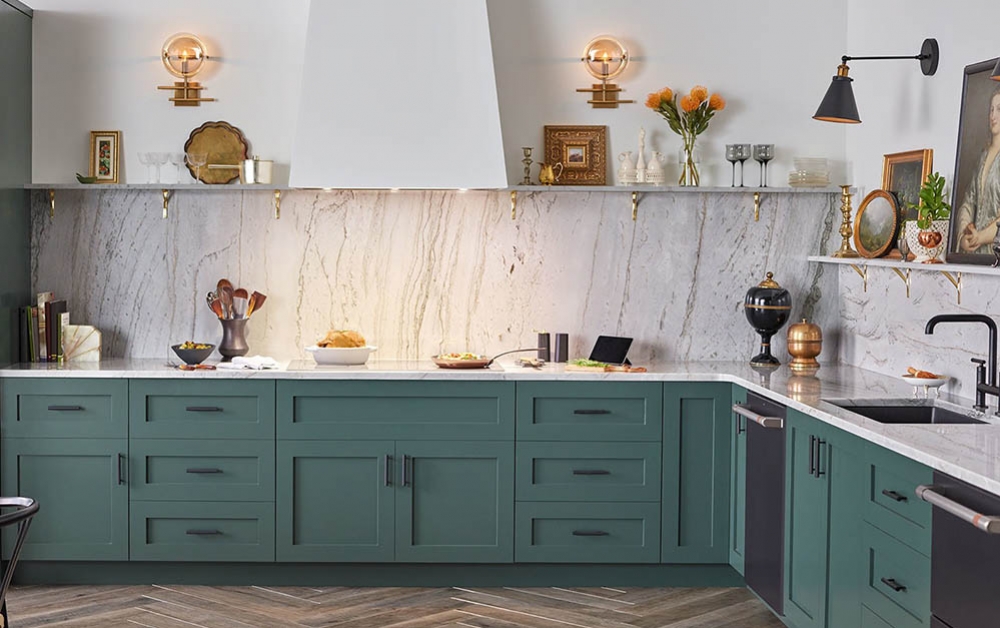
1 | Verdure
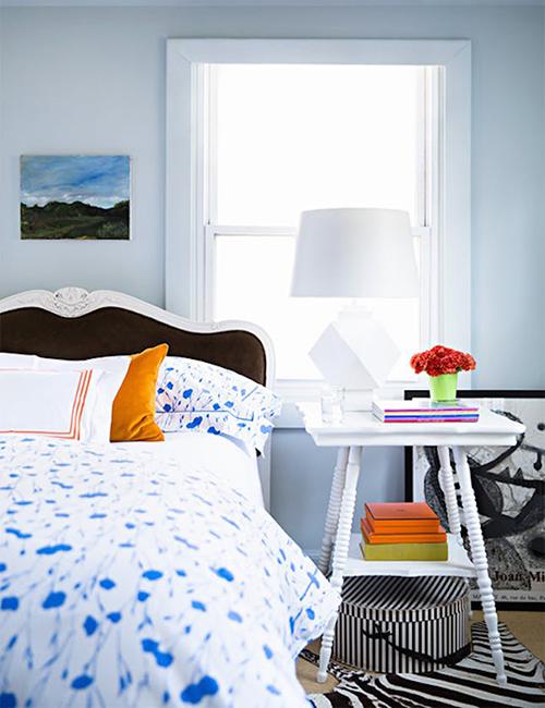
If I could describe this color palette in a few words, I would say “indoor garden.” The palette’s name Verdure literally means lush green vegetation. So, the apple doesn’t fall too far from the tree here. This palette is made up predominantly of cool tones, including purple berry colors, eggshell blue, and a bright vegetable green color called Celery. This color palette is perhaps the most relatable to Pantone's Color of the Year 2017, Greenery. Use these vegetal hues as a statement color or create a theme with all of them together in one room.
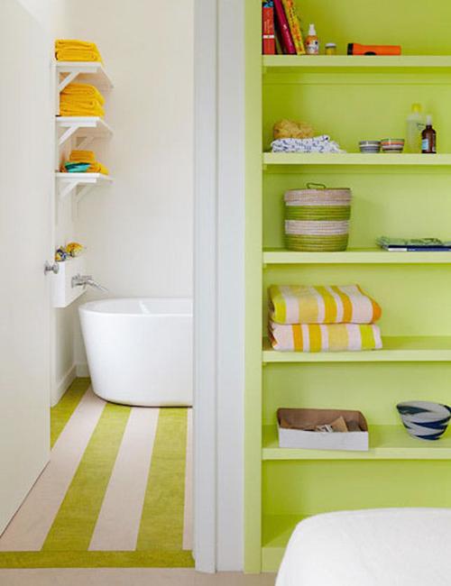
via casavogue.globo.com and brit.co
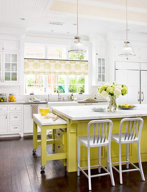
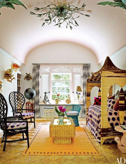
2 | Playful
The Playful palette is as youthful as it gets with these fun and bright colors to punch up your room décor. With names like Lime Popsicle and Minion Yellow, you can tell what theme the people at Pantone were going for. Minion Yellow is one of the most infamous colors of this palette because it’s the first color to be branded after a character! Yes, this cheery yellow is based on the little guys from the movie, Minions, and I’m loving every second of it. Incorporate this fun-loving palette into your home on a statement chair or door. Pair it with neutral colors to keep your palette simple, yet invigorating. Looks really good with warm toned wooden floors and furniture.
via brit.co and bykoket.com
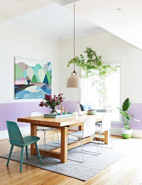
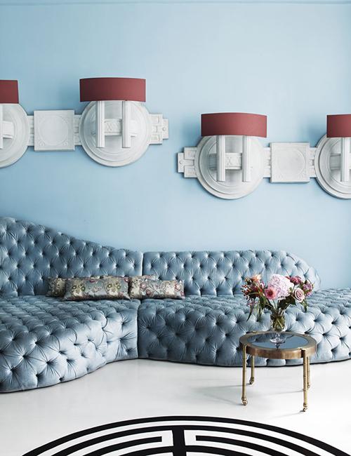
3 | Discretion
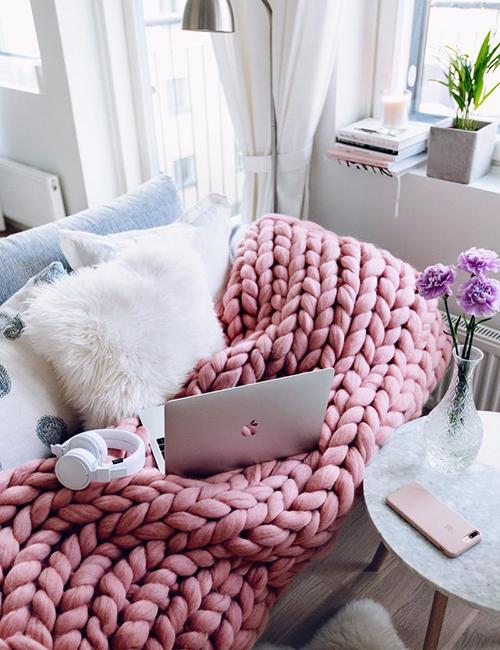
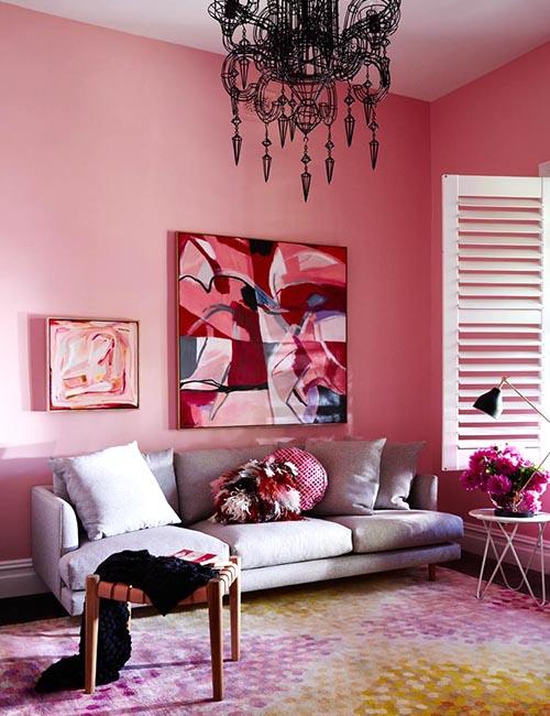
The most romantic and vintage out of the group is Discretion. If Jane Eyre had to be described in colors, it would be Pantone’s Hawthorne Rose and Elderberry. This romantic pink and purple have a serious, yet feminine undertone with a sense of empowerment. You can easily use these colors for your wall or accessories like couch throws. How can you not have a Hawthorne Rose colored knitted throw? It’s obviously a necessity for couch snuggles and late-night book reading.
via brit.co
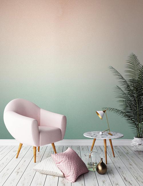
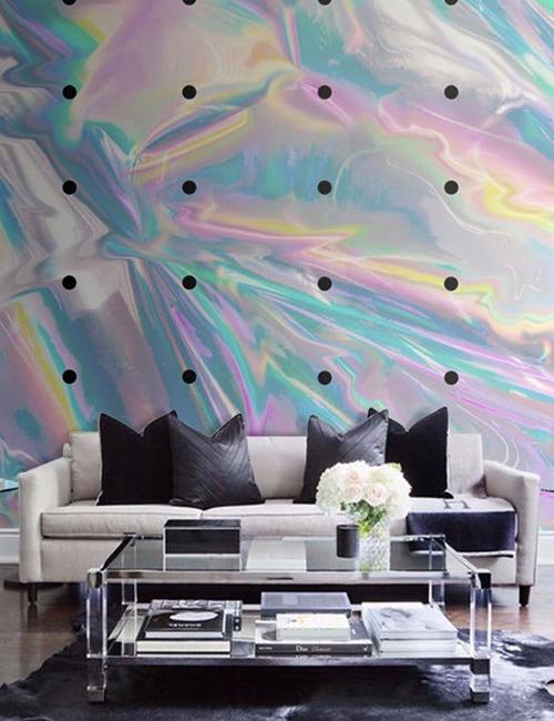
4 | TECH-nique
Pantone has a keen eye for observing trends and knows our obsession with the latest in technology. This palette is technology based with colors like Frosted Almond, Brilliant White, bright turquoise, and purples. If you look closely, they’re reminiscent of the iridescent trend that reflects the prominent shiny colors in rainbow sheens. Incorporating these colors isn't hard, so don’t sweat the TECH-nique and use them for large general areas. Frosted Almond is a safe neutral color to use, but think outside the box and have it fade into teal as a cool ombre effect. Another way to use these tech-based colors is with the use of iridescent wallpaper paired with black and white furniture to create a futuristic look.
via pantone.com
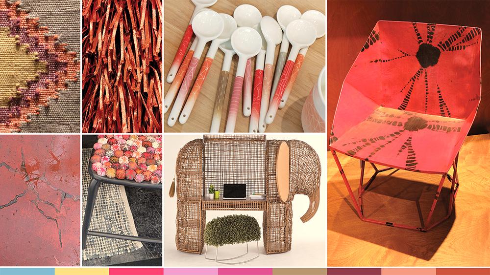
5 | Far-Fetched
Is it just me or has everyone caught the traveling bug? If it seems like everyone is traveling these days, it’s because it's true! It’s become a trend to travel and with travel comes souvenirs from the exotic places that influence the way we decorate our home. This is the exact mindset that inspired Pantone to come up with the Far-Fetched color palette. With our fascination with cultures around the globe, we pick up colors that are familiar to the places we visited. This palette is full of warmth like Red Rooibos tea and Silk Yellow that'll have you craving sun! These colors are great for a rustic theme. Pair them with weaved accessories like chairs or tables and you’ll be set.
via idealhome.co.uk
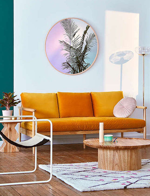
6 | Resourceful
In color science, orange and blue are complementary colors of the color wheel. The even amount of cool and warm tone balances a room out when the two are paired and can create a striking combination. These two colors are energetic and will cultivate a productive mood. I’m not saying it’ll replace your morning coffee, but give it a shot and see the difference it’ll make in your home office. Use the orange for a statement couch to create a high-energy vibe and the blue as a background color to balance the brightness.
via elledecor.it
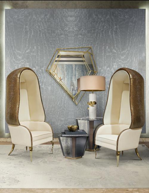
7 | Intricacy
The word is in that metals are now a part of the New Neutrals. Neutrals have been known for mostly beiges, but now it’s revamped and has accepted metallic as part of the crew. This palette focuses on our need for detail and for everything to have an individualized touch to it. Made up of golds, champagnes, a pop of Holly Berry Red, and Yellow Sulfur, it just spells New-Age Hollywood. Holly Berry Red is a beautifully deep and velvety color that pairs well with shiny materials like satin, if it’s matte. To create a gorgeous luxe feel to the home, use champagne gold as the predominant color to be paired with gray to keep it subtle.
via bohohome.com and consort-design.com
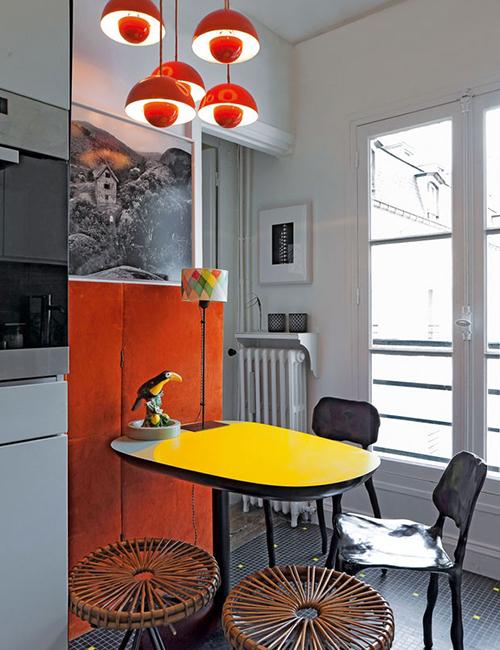
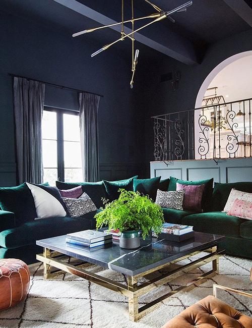
8 | Intensity
Pastel colors had their time to shine, now it’s time for the bold and brazen to reign. Seriously, with colors like Bossa Nova, Molten Lava, and Ember Glow, I just feel enthralled with passion and intensity. This palette is saturated with color and can be used generously throughout the home. All you need to do to balance the color intensity is to throw in some black staple pieces like black metal chairs. Dark walls also mellow it out. Balance the predominantly warm colors with pops of blues on statement chairs or accent pillows.