When it comes to summer, there’s only one thing on everyone’s mind. Beach. I don’t know about you, but I’m ready to hit the waters and work on my tan as soon as possible. The beach house awaits and I have the best colors for you to play with for your summer projects. Here’s a trusty list of perfect beach house colors to incorporate into your home away from home.
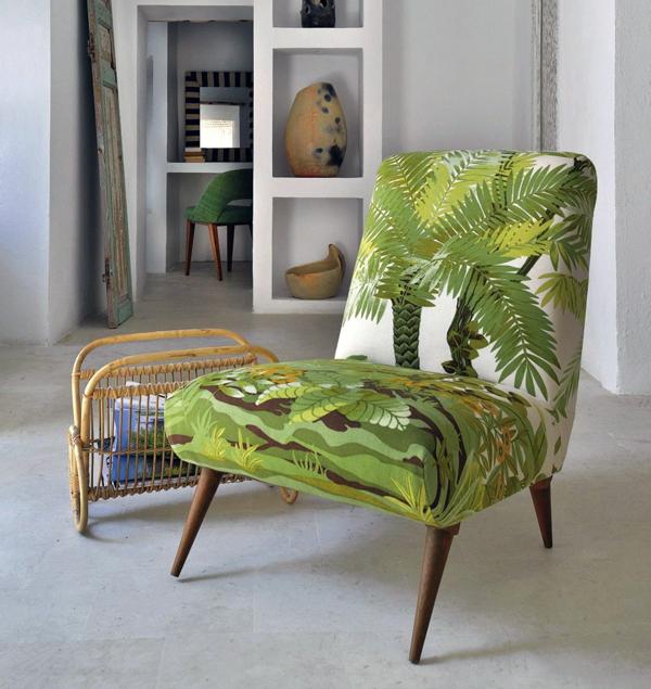
1 | Greenery - Lime Green
As everyone should know, Pantone’s color of the year is a bright shade of green called Greenery. It makes perfect sense that it’s the color of the year because it is the pure embodiment of Summer 2017. Lush green foliage, a refreshing sip of limeade, and avocado toast. A pop of green will make anyone’s summer day complete. Add a pop of green to your humble beach abode by using it as an accent color. Use a splash of bright green for accessories or have a whole accent wall dedicated to it.
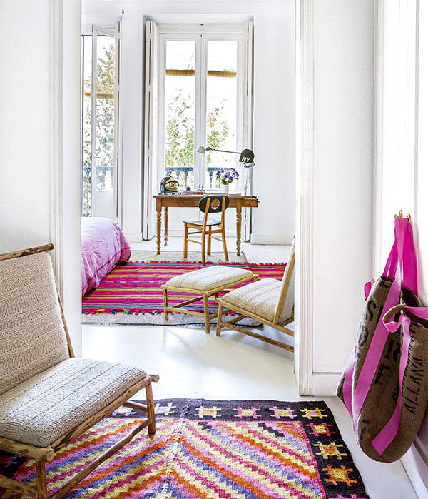
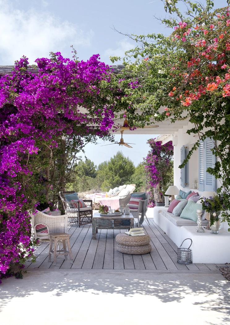
2 | Pink Yarrow - Tropical Pink
Tropical hot pink is definitely hot for summer. It’s playful and adds the right amount of attention to a room. This pink is perfect for a space in your room that needs a bit more love and consideration. Use it for focal pieces that you definitely want people to see like huge paintings or the main seating.
via Lonny.com
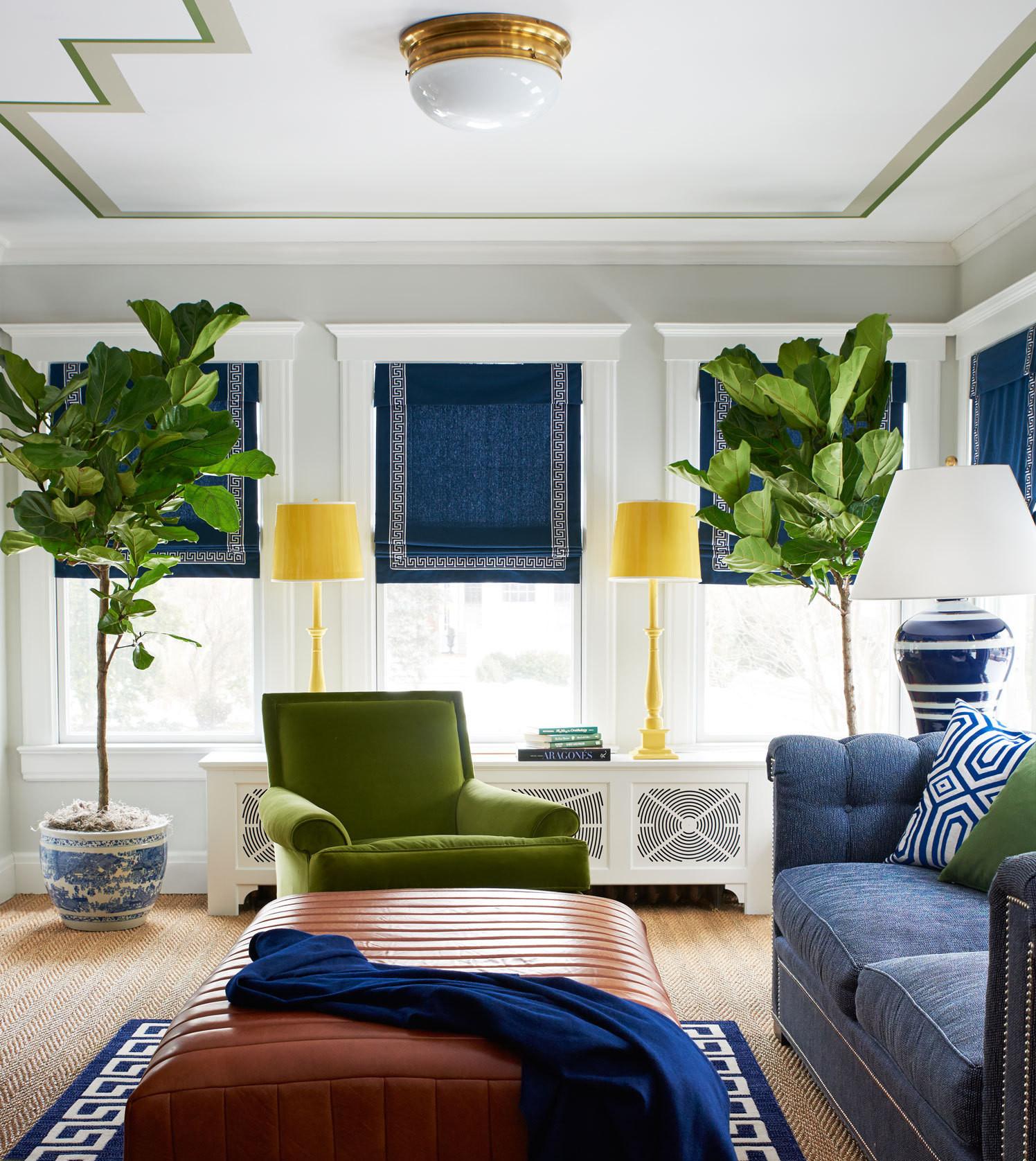
3 | Lapis Blue - Deep Cobalt Blue
Did someone say statement color? Because Lapis Blue is it. This daring color may come off intimidating at first, but all you need to do is balance it with bright neutrals and have it as the main star of the space. If you’re feeling brave, pair it with Greenery for a fantastic color duo. It works great for large format items like rugs and compliments neutral staple pieces such as bright white tables.
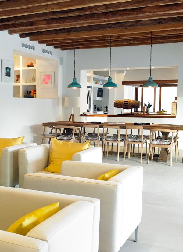
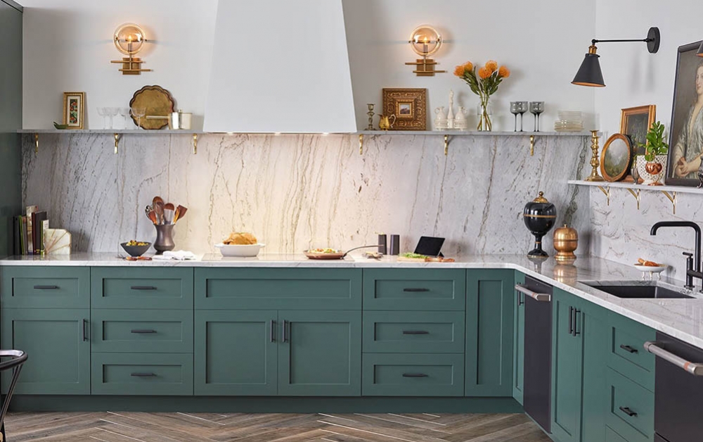
4 | Primrose Yellow - Sunny Yellow
Bring the sun into your beach house with bright yellows. Nothing says summer like sun and when you’re tired of getting sunburnt, you can still bask in it safely from your home. This cheery color is great for the kitchen as a back splash or your kitchen table top.
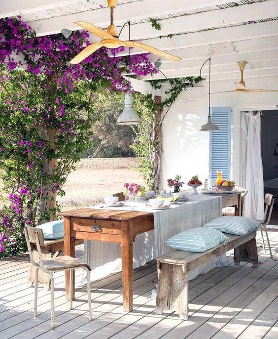
5 | Pale Dogwood - Neutral Soft Pink
This comforting new neutral pink will help you mellow out and is a great neutral to balance out bright colors. Pair this color with Greenery or Island Paradise for a light-hearted vibe. Can be used for staple pieces like couches, walls, floors, beds, and seating.
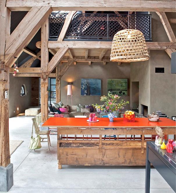
6 | Flame - Fiery Orange
It’s all about the wow factor and this flaming orange is ready to impress. It’s definitely a pick me up color that will have your eyes locked on it. This color is meant for rooms with high amounts of activity like a dining room for dinner parties or a living room for get-togethers. Flame orange is a natural life of the party.
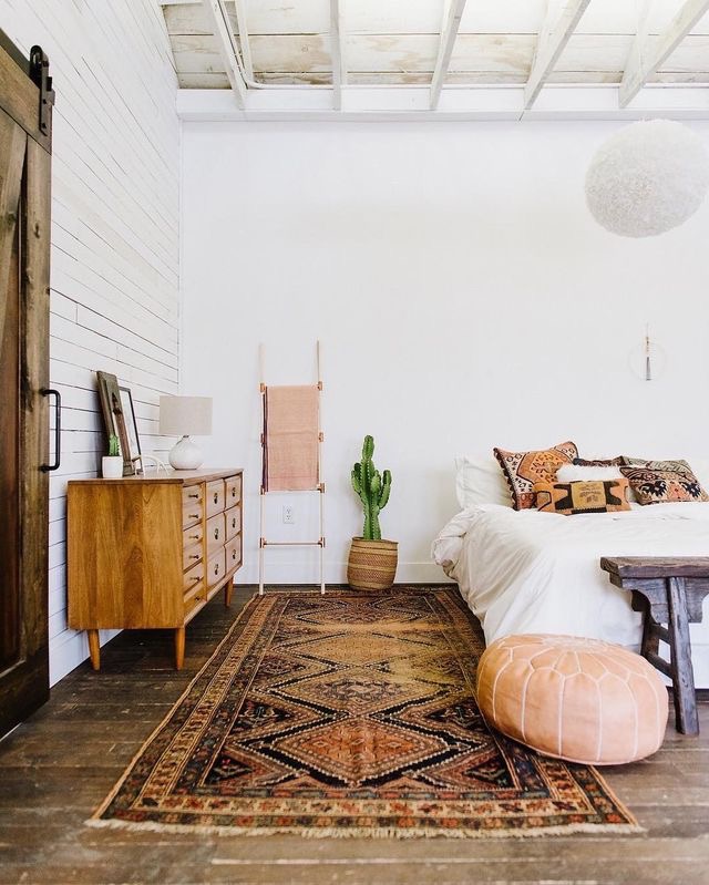
7 | Hazelnut - Warm Tan Neutral
Perfect beach neutral, right here. It will pair with any bright color you choose and flatter it immensely. It’s not your basic beige, either. It is a literal beach tan for your space that will make your room feel coated in warmth and coziness, while still lively enough to be in harmony with bright summer colors. Use it for large pieces and throw any color accessory you want on it because, honey, it’s going to work.
8 | Island Paradise - Caribbean Sky Blue
Cool off from the summer heat with this cool island blue. This soft and calm color will help you unwind from a long day of vacation. A Caribbean sky-blue bathroom is the perfect go-to or for the perfect escape. Use it in your kitchen as a statement piece for seating.
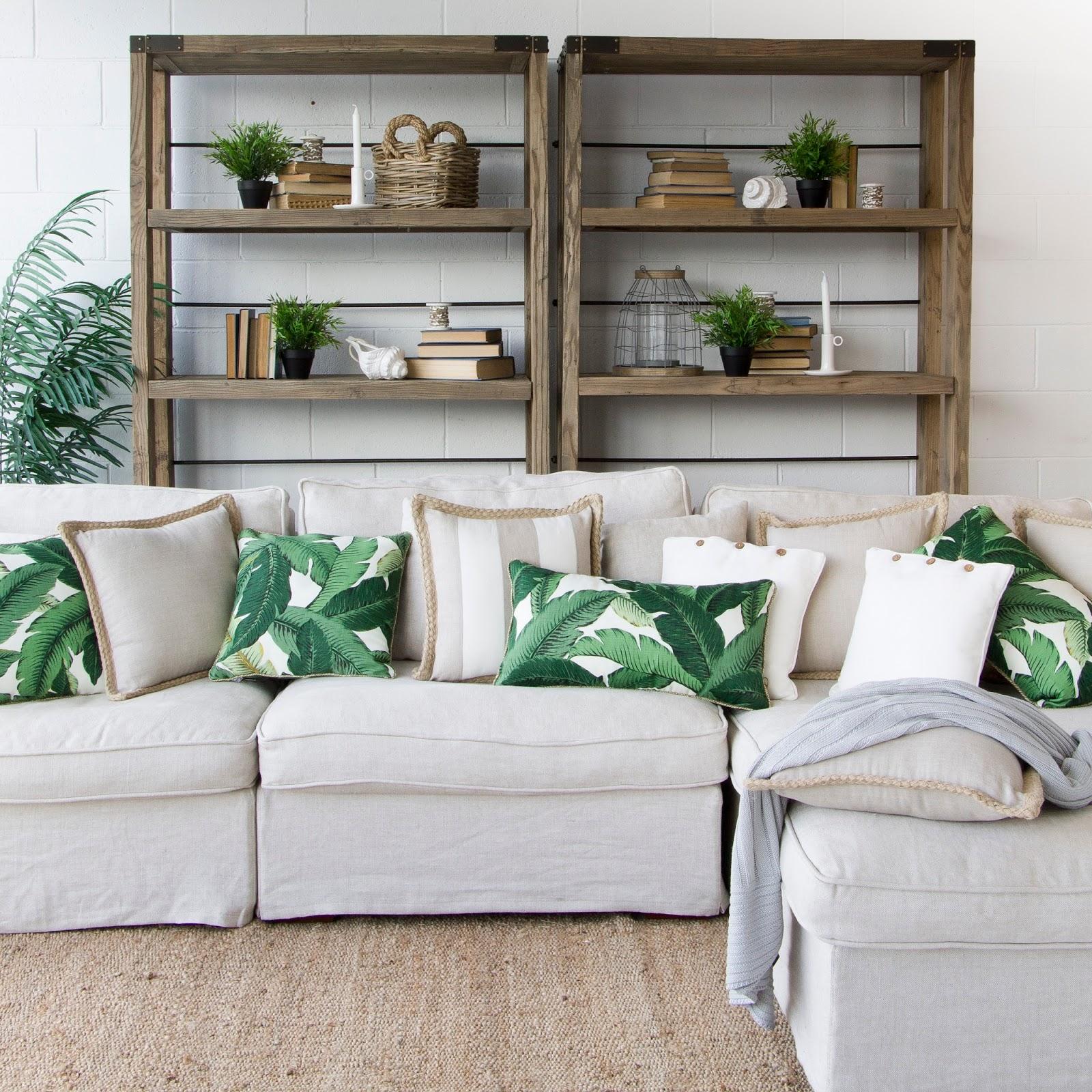
9 | Kale - Hearty Green
Keep your beach house down to earth with this earthy green. A complementary background color to all the bright color tones of summer 2017. Immerse yourself in this green by having your walls covered in it or bring plant life into your home.
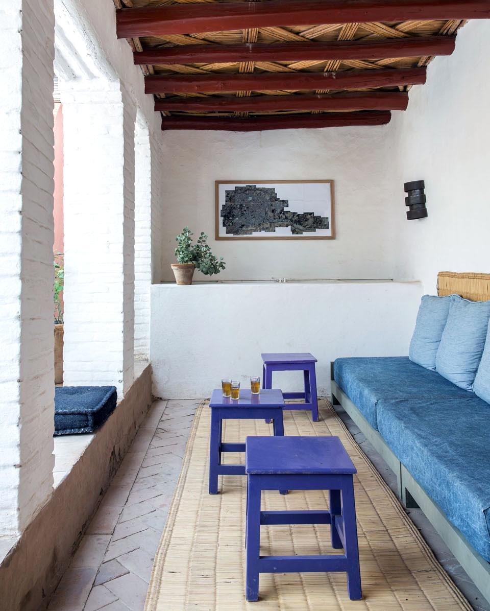
10 | Niagara - Nautical Waters Blue
Colored neutrals are definitely a thing and this blue has been added to the ever-growing list of new neutrals. Honestly, it’s just an excuse for me to throw blue on everything and that’s fine by me. This color can create a statement without overpowering a room, so you can pair it with bold colors like pink and red to have dynamic color combinations.